UX/UI DESIGN
Freshers', 2025
The old Freshers site was a hub of outbound links that sent students everywhere but answered nothing. I redesigned it as an 11-page information hub, the first time all Freshers content had ever lived in one place.
Timeline:
May – August 2025
Tools:
Figma, WAVE, WCAG 2.1, HTML/CSS
Role:
Sole UX/UI Designer, Researcher & Front-End Support
Problem Statement
New students struggle to discover and navigate Freshers because information is fragmented across multiple platforms, lacks context and often assumes prior knowledge of the university.
Solution
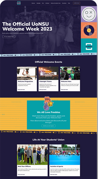
The redesigned Freshers site brings everything into one place for the first time: 11 pages covering events, club nights, wellbeing, sports, fairs, and more, all under a consistent bento grid layout that matched the campaign's modular brand identity. The homepage embeds a third-party ticketing widget directly on the page, styled to the Freshers brand, so students can browse and purchase tickets without being redirected away. Every page is self-contained but connected, with clear navigation that lets students jump to what they need without losing their place.
Impact
Generated 97,645 views and 298,207 interactions across 11 pages during the campaign with Club Nights alone seeing a +177% increase in views and +414% increase in interactions year-on-year.
01 - THE PROBLEM
The Freshers site sent students everywhere and answered nothing
Freshers is the most important two-week window in a new student's university life. First impressions, friend groups, and early habits are all shaped during this period. For the Students' Union, it's also one of the highest-stakes moments for engagement and event attendance all year.
The old website wasn't built to meet that moment. It functioned as a directory of outbound links where every CTA sent students to a different external site, a different platform, a different context. There was no information to speak of on the site itself. New students arrived looking for answers and left to go find them elsewhere, if they bothered at all.
1
Off-brand & visually incoherent
The previous design didn't align with the Students' Union brand identity. For an event that's meant to be exciting and welcoming, the visual experience failed to communicate either – undermining trust before students had even read a word.
2
Every CTA led somewhere else
Each action a student tried to take such as checking events, finding societies, buying tickets – redirected them to an external page or separate site. This broke the browsing experience entirely, making it nearly impossible to navigate back and creating a disjointed, distrustful journey at exactly the wrong moment.
3
Minimal information about what Freshers actually was
New students arriving at university for the first time, many from outside the UK, had no way to understand what Freshers involved: what was happening when, or what they needed to do to participate. The site assumed prior knowledge that first-year students couldn't possibly have.
4
Fragmented content across multiple platforms
For events and tickets, students were sent to a third-party platform with no preview, no context, and no connection to the Students' Union brand. Students saw an unfamiliar interface and had no way to browse what was on before committing to navigate there.

02 - RESEARCH
Stakeholder interviews across an entire organisation and one idea that changed the experience
Unlike a typical two-stakeholder brief, the Freshers redesign involved coordinating content and requirements from multiple departments across the Students' Union — each with their own priorities, timelines, and goals. Research here wasn't just about understanding users but it was about managing a complex, multi-stakeholder content architecture from the start.
Stakeholder interviews & organisation-wide meetings
Meeting 1 — Requirements & pain points
Why this method
A cross-departmental session ensured every team could flag what they needed on the site from the start, preventing scope creep where departments request additions mid-build.
Key outcome
Agreed that all Freshers content would live on one site for the first time. Every department listed their required pages, content and I confirmed the technical approach.
My suggestion
I proposed embedding an events widget from the third-party ticketing platform directly onto the site, so students could browse and purchase tickets without leaving the Freshers site. This was approved and became one of the most impactful features of the redesign.
Ongoing organisation meetings
Why this method
With 12 content areas and multiple department owners, a single brief wasn't enough. Regular cross-orgnisation meetings allowed me to gather updated copy, clarify requirements, and catch changes before they became design problems.
Clarifications
Final page list and content owners. Copy and deadlines. Widget integration requirements. Brand alignment across all sections
Design Impact
These sessions gave me a confirmed content architecture to design against and surfaced the scope creep challenge that would define the project's most difficult period.
❗️ MAJOR CONSTRAINT
Content was supposed to be delivered by the end of June. It wasn't. Departments kept submitting content slowly, and even after a hard deadline was set, requests kept coming in: "can we just add this?", "can we change this section?". The challenge was coordinating content across an entire organisation while keeping the project moving. The organisation-wide meetings helped by creating accountability, but managing 11 pages of content from multiple owners with different timelines is genuinely difficult to do cleanly. The site didn't launch until everything was confirmed which was the right call.
User personas
Jun – The Excited Explorer
A new student who is enthusiastic but easily overwhelmed. She wants to know what's on, what she can get involved in, and whether it'll be worth her time but she'll disengage quickly if the information is hard to find or the page feels cluttered.
"What's actually happening and when? What's worth it?"
Sophie – The Organised Planner
A student who wants to plan Freshers properly by knowing the schedule, understanding what each event involves, and not missing anything important. He's goal-oriented and easily frustrated by vague or incomplete information.
"Where's the full schedule? I need to plain it properly so that it's efficient without missing out on anything"
KEY INSIGHT FROM PERSONA INTERVIEWS
Both personas had the same underlying frustration with the old site: they couldn't get a complete picture of Freshers in one place. June would disengage when sent to multiple external platforms. Sophie would lose trust when information was missing or inconsistent across pages. The solution had to be comprehensive and self-contained which validated the "everything in one place" design direction from the start.
03 - DESIGN PROCESS
A bento grid approach to 11 pages of content across 12 topic areas
Layout direction – bento grid
The graphic designer had already established a modular visual identity for the Freshers rebrand. Recognising the natural alignment between a modular brand language and a bento grid web layout, I proposed the bento grid approach for the site structure, a design pattern that organises content into visually distinct, scannable blocks of varying sizes, allowing hierarchy to be communicated through proportion rather than just typography alone.
For a site with 11 distinct pages covering very different content types, from sports to wellbeing resources to nightlife events, the bento grid gave each section its own visual weight while maintaining a coherent, brand-consistent aesthetic across the whole experience.
The widget integration
One of the most impactful suggestions from the initial stakeholder meeting was embedding a ticketing widget directly into the Freshers homepage. Previously, students were sent to an entirely separate platform to browse and buy event tickets with no preview, no brand context, and no easy way back. The embedded widget brought ticket browsing in-house, styled to match the Freshers brand colours, so students could see what was on and purchase without ever leaving the site.
Sending users to an external ticketing platform mid-browse is a conversion killer as it breaks context, introduces an unfamiliar interface, and removes the emotional energy of the browsing experience. Bringing the widget embedded kept students in the Freshers environment while they made purchasing decisions, which is exactly where you want them when they're deciding whether to spend money.

Hi-fi mockup exploration
Rather than starting with wireframes, I made a deliberate decision to go straight to hi-fi mockups. There were two reasons for this.
First, the graphic designer had already established a rich visual identity for the Freshers rebrand. Second, and more importantly, I knew that wireframes alone wouldn't communicate the vision clearly enough to stakeholders at this stage. The bento grid layout relies heavily on imagery, visual weight, and brand styling to work so a bare wireframe risks looking like a grid of empty boxes, making it hard for stakeholders to evaluate whether the layout actually serves the content and the brand. Showing hi-fi mockups from the start gave them something they could genuinely react to.
The full page list hadn't been confirmed yet, so I used the pages I knew were definitely going on the site to populate the mockups so that it's enough to make a real direction decision without waiting for all content to arrive. All three used a bento grid structure, but differed in how the hero was structured and how content was weighted and ordered across the page.

1
Mockup 1: Clean hero, strong bento structure — the preferred base
The first layout led with a full-width image hero and a single primary CTA is immediate, uncluttered, and action-oriented. The bento grid structure below it was clear and well-organised, with content ordered logically to guide students through what Freshers involved.
2
Richer hero with navigation bento boxes
The second layout added more to the hero: an image with supporting text alongside it, and three prominent bento box columns sitting directly below acting as large navigational buttons to the most important pages. This gave the hero more context and wayfinding power upfront, at the cost of some visual simplicity.
3
Doodle and image-led — visually bold but harder to navigate
The third layout leaned heavily into the campaign's visual identity, using illustrations and images as backgrounds for most of the bento boxes and buttons throughout. While visually distinctive, the approach prioritised aesthetic over clarity made content harder to scan and the hierarchy less immediately legible. Screenshots available.
STAKEHOLDER FEEDBACK & THE FINAL DECISION
Stakeholders preferred the first layout for its clarity and structure but saw value in the hero layout from the second option. Rather than choosing one option, they asked to incorporate the navigational bento boxes from option 2 into the hero section of option 1. I agreed with this call: the base structure of option 1 was the strongest foundation, and adding the bento navigation boxes to the hero gave students an immediate wayfinding tool without compromising the overall clarity of the page. The third option, while visually interesting, was ruled out because legibility and scannability mattered more than visual boldness for a site serving thousands of students arriving with specific questions to answer.
The International Students page, a decision I made myself
The International Students page was originally on the content plan but was dropped when the person responsible ran out of time. I was told to remove it. Instead, I took the initiative to research and write the content myself and shipped the page anyway.
As an international student myself, I knew first-hand what it felt like to navigate a new university in a new country with no dedicated guidance. A Freshers site that served 13,000+ incoming students but said nothing to those arriving from abroad was a real gap, not just a nice-to-have. The page covered practical information specific to international students: registration, support services, culture differences and how to navigate the early weeks. It cost me additional time but it was worth it.
04 - KEY DESIGN DECISIONS
Every decision mapped back to the same goal
Each design feature maps directly back to a specific failure of the old experience. These weren't decorative choices but they were carefully thought solutions to documented problems.
1
Embedded events and tickets widget on the homepage
Solves: Students being sent off-site to browse and buy tickets with no preview or context.
The widget was embedded directly into the homepage and styled to match the Freshers brand palette. Students could see upcoming events, read descriptions, and purchase tickets without leaving the site. This was the single change most likely to reduce drop-off at the ticketing stage.
2
Bento grid layout — modular, scannable, on-brand
Solves: Visual incoherence and a lack of clear content hierarchy on the old site.
The bento grid aligned directly with the graphic designer's modular brand direction, creating a visual system where different content types could coexist on the same page without competing. Blocks of varying size communicated priority, letting students scan the page and orient themselves quickly without reading everything.
3
Self-contained information architecture, 11 pages, one site
Solves: Fragmented content spread across multiple platforms with no coherent home.
For the first time, every piece of Freshers content: events, officers, sports, wellbeing, food, transport, guidebook lived in one place. The navigation was structured so students could jump to what they needed without losing their place, and every page was written to stand alone as well as connect to the broader site.
4
International Students page — content researched and written from scratch
Solves: A gap in provision for one of the most underserved groups in the incoming student cohort.
Rather than remove the page when its owner ran out of time, I researched and wrote the content myself by drawing on personal experience as an international student and knowledge of the university's support services.
5
Brand-consistent visual design across 11 pages
Solves: The previous site's lack of visual cohesion and brand recognition.
Working with the graphic designer's established Freshers rebrand, every page was designed to feel like part of the same campaign — consistent typography, colour palette, and component style throughout. For students moving between pages, the experience felt unified and intentional rather than cobbled together from separate briefs.
05 – ACCESSIBILITY CONSIDERATIONS
Designing for 13,000+ students means designing for everyone
With an audience of over 13,000 incoming students — many arriving from different countries, with different devices, different abilities, and different levels of familiarity with UK university systems, accessibility wasn't optional. It was central to whether the site actually worked for the people it was built for.
WCAG AA & AAA COMPLIANCE
Every page was tested against WCAG 2.1 standards using the WAVE Web Accessibility Evaluation Tool throughout the design and build process. The most common issues found were missing alt text on images. The audit was also reviewed and passed by the UX team at the University, adding an additional layer of institutional validation.
ALT TEXT ACROSS ALL IMAGES
With 11 pages of content and imagery supplied by multiple departments, missing or inadequate alt text was the most significant accessibility risk. Rather than treating it as a last-minute check, alt text was reviewed and corrected, ensuring screen reader users could access all visual content meaningfully.
RESPONSIVE DESIGN, MOBILE-FIRST
New students arriving during Freshers are predominantly on mobile. The bento grid layout was designed with responsive behaviour built in, ensuring the modular structure adapted cleanly to smaller viewports without horizontal scrolling, overlapping elements, or broken touch targets.
06 - IMPACT
298,207 interactions on a site that, the year before, sent students elsewhere
The most important context for these numbers: this was the first time all Freshers content had ever lived in one place. There is no direct before and after comparison because the previous site wasn't designed to hold content, it was designed to link away from it. These figures represent what happens when students actually have something to engage with.
Across the full site, the Freshers campaign generated 97,645 views and 298,207 interactions. Homepage, Fairs, and Club Nights alone account for 68,936 views and 218,712 interactions and the remaining eight pages contributed a further 28,709 views and 79,495 interactions on top.
40,488
Homepage views during the campaign
137,056
Homepage interactions
3.4x
Interactions per visit on the homepage
Club Nights – the clearest year-on-year comparison
Club Nights is the only page with a direct equivalent from the previous year, making it the most controlled before/after comparison available.
CLUB NIGHTS – PREVIOUS YEAR
1,898 views, 5,540 interactions, 2.9× depth
A standalone page linking outward to the ticketing platform. Students arrived, saw a list, and were sent elsewhere to find out more or buy tickets.
CLUB NIGHTS – 2025 REDESIGN
Integrated into the full Freshers site, with the third-party events widget embedded directly on the homepage. Students could browse and purchase without being sent elsewhere first.
+177%
Club Nights views year-on-year
+414%
Club Nights interactions year-on-year
5.4x
Interactions per visit in 2025, up from 2.9× the year before
WHAT THE ENGAGEMENT DEPTH TELLS US
The jump from 2.9 to 5.4 interactions per visit on Club Nights isn't just more traffic but it's students doing more per session. That's a signal of a better experience: students finding what they needed, exploring further, and engaging with content rather than bouncing to find it elsewhere.
What I'd measure next time
With a better setup, I'd track scroll depth per page to identify which sections students engaged with most and which they skipped, widget click-through and conversion rates to understand the direct ticket purchase impact of the embedded integration, and time-on-page as a proxy for whether content depth was landing. I'd also want to run at least a short post-Freshers survey with new students as even five responses would add qualitative texture to the engagement numbers.
07 - REFLECTIONS
What I learned building for an organisation
This project stretched beyond typical UX work. Designing 11 pages of content for 13,000+ incoming students, across 12 departments, with shifting deadlines and a scope that kept growing required as much project management and stakeholder communication as it did design thinking.
WHAT WORKED WELL
1
The organisation-wide meetings created shared accountability across departments in a way that individual conversations couldn't. When everyone was in the same room, content owners were less likely to deprioritise their deadlines and when they did, I had a clear record of what had been agreed. For multi-stakeholder projects at this scale, collective sessions are more effective than bilateral chasing.
2
The widget integration idea came from listening carefully in the first stakeholder meeting, not from a brief, and not from a prompt. Proposing it, getting it approved, and seeing it implemented as one of the most impactful features of the redesign is a reminder that the design brief is a starting point. The best contributions often come from noticing what wasn't asked for.
WHAT I'D DO DIFFERENTLY
1
I'd establish a formal content freeze date with consequences. The rolling content changes were the biggest source of project risk, and while the site launched cleanly, getting there required absorbing changes that should have been caught earlier. A structured content sign-off process per department, with a final freeze two weeks before launch, would make this manageable at scale.
2
I'd build in at least one round of usability testing with incoming students before launch, even a lightweight hallway test with five participants. The personas and stakeholder sessions were valuable, but new students navigating the site for the first time would have surfaced friction points that were invisible to me and the internal team after months of building it.
Final Mockup Designs