UX/UI DESIGN
GradBall, 2026
The old graduation event site buried critical information, hid ticket prices, and had no primary CTA which led to confused students, flooded inboxes, and missed sales. Here's how I redesigned the experience from scratch.
Timeline:
March – April 2026
Tools:
Figma, WCAG, ChatGPT, HTML/CSS
Role:
Sole UX/UI Designer, Researcher & Front-End Support
Problem Statement
Students need a clear, fast way to understand and act on Graduation Ball information, but scattered content and a two-site experience create confusion and delay decisions.
Solution
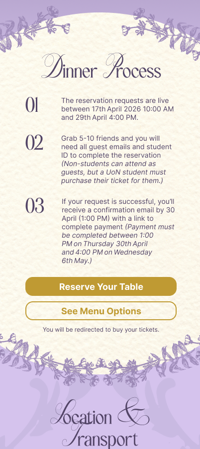
The redesigned site opens with an editorial hero and immediate CTA, replacing the buried ticket link of the old experience. Three comparison cards surface pricing and inclusions at a glance, a dedicated dinner reservation section guides group planning, and every handoff to the ticketing platform is explained so that students arrive informed and ready to act.
Impact
Revenue grew 10% year-on-year to £163K, with 3,781 tickets sold and an average of 4x page interactions per visit, evidence that students were finding what they needed and acting on it.
Final Mockup Designs



01 - THE PROBLEM
Students couldn't figure out the Grad Ball page fast enough to buy a ticket
The Graduation Ball is one of the biggest events in the Students' Union but the website meant to drive ticket sales was actively working against that goal. Key information was buried, prices were hidden, and the only way to buy a ticket required scrolling to the very bottom of a long, copy-heavy page.
The result was predictable: students dropped off before converting, contacted the Events Team with questions the website should have answered, and in some cases, couldn't buy tickets at all due to eligibility confusion that was never clearly surfaced.
1
No primary CTA on landing
There was no clear "Get Tickets" button when users first arrived. With no immediate action available, students had no signal to act, leading to early drop-off and missed sales.
2
Dense, unscanned copy buried critical rules
Eligibility restrictions including that graduating students from 2024 couldn't purchase were hidden in walls of text. Students who missed this flooded Instagram and email with questions, creating avoidable support load for the Events Team.
3
Ticket types were scattered with no comparison
Different ticket types (dinner, entertainment, etc.) appeared in separate sections with no prices visible and no way to compare. Pricing was only revealed after clicking into a button labelled "Registration Process": a label that gave no indication that it contained pricing information.
4
The ticket link was at the very bottom of the page
The actual purchase link was the last thing on the page. With no navigation shortcut and no earlier CTA, students who didn't read every section and didn't want to scroll to the bottom had no way to find it.
5
Confusing navigation with no clear hierarchy
The menu structure and readability didn't signal what was most important, making it hard to find relevant sections quickly.
02 - RESEARCH
Two stakeholder interviews, AI-assisted personas, and a constraint that changed everything ....
Rather than running broad user research with no brief, I structured the discovery phase around two focused stakeholder interviews which is the most efficient method given the tight four-week timeline and the fact that the events team had direct knowledge of what had caused problems the previous year.
Stakeholder interviews
Interview 1 — Requirements & pain points
Why this method
Stakeholders held direct knowledge of prior-year issues which was faster and more reliable than inferring pain points from analytics alone at this stage.
Insights
The Events Team's biggest frustrations mapped directly to user frustrations: confusing eligibility, buried pricing, and a registration flow that required too many steps. The web team confirmed a form-based registration system could be built in the existing DMS.
Design Impact
Established that a cleaner information hierarchy and a dedicated registration form were the two highest-priority changes.
Interview 2 – Form Details & User Journey
Why this method
After the web team met internally, there were open questions about guest limits per table, DMS reporting requirements, and what content would live on each of the two sites. A second session resolved these before any design work started, preventing costly rework later.
Clarifications
Guest limits per table · DMS report structure · Final site map (intro blurb, ticketing link, site map, infographics, transport info, taxi offer, FAQs) · Which content should avoid repetition across the two sites.
Design Impact
Gave me a confirmed content structure to wireframe against, and surfaced the most complex constraint of the entire project.
❗️ MAJOR CONSTRAINT
A key business decision required hosting across two separate websites: one for pre-sale information and one for ticket purchasing through the third-party ticketing platform. While technically the content could have lived in one place, the final requirement was two sites with no repetitive content that might confuse users. This became the central design challenge: how do you create a seamless mental journey when the experience is split across two domains?
AI-assisted user personas
Emily – The Social Planner
Excited about the Grad Ball but information-sensitive. She wants to make a decision quickly for example, if she has to dig for details, she'll lose interest or ask a friend to figure it out for her. Social coordination is central to her decision.
"Is this fun and worth it? What exactly am I getting for my money?"
James – The Organiser Friend
Took on the responsibility of coordinating the group's table. His anxiety is about logistics: guest limits, deadlines, what happens if someone drops out. He needs specifics and he needs confidence that the process won't be complicating.
"Can I plan this without messing it up? What are the rules?"
KEY INSIGHT FROM PERSONA INTERVIEWS
Emily and James represent two failure modes of the old site: Emily drops off because she can't get excited from vague copy. James escalates to support because the rules he needs aren't clearly stated. A redesigned site needed to serve both the emotional journey (is this worth it?) and the logistical journey (how does this actually work?) simultaneously.
03 - DESIGN PROCESS
Transforming scatterd information to a single journey ..
How might we ....
Brainstorming began with a set of HMW questions anchored to the problem statement. The constraint of the two-site setup meant that ideas had to work with a hard constraint: we couldn't simply move ticketing content to the information site. Instead, the focus shifted to how the information site could prepare students so well that the transition to the ticketing platform felt natural, not jarring.
Ideas explored in this phase included: an "event at a glance" hero section, visual infographics to replace dense text, microcopy that proactively surfaced eligibility rules, and clear bridging CTAs that set expectations before users clicked through to the ticketing platform.
The student's mental journey as the logic behind the wireframe
Rather than organising the page by content category (which is how the old site was structured), wireframing followed the question sequence a student naturally asks when they land:

Branding constraint -> design opportunity
By the time wireframing began, the graphic designer had already provided a Bridgerton-inspired visual identity which is an elegant, editorial, with a warm palette and refined typography. I used this to raise the bar for information hierarchy. An editorial layout demands generous spacing and clear typographic hierarchy which meant the copy-heavy density of the old site was architecturally incompatible with the new brand direction. The aesthetic gave me a principled reason to strip content and structure it more clearly.
Wireframe exploration
With the branding direction established, the mood boarding process and the mental journey framework confirmed, I explored four distinct wireframe layouts before committing to a structure. The goal was to find the arrangement that let a student scan the page and understand the event without having to read everything carefully.

1
Wireframe 1 ruled out early
Wireframe 1 was inspired by the UoNSU's main branding, using a modular bento design. This was ruled out early as the structured worked against the primary goal – the CTA didn't read as the most important action on the page. Modular grids also tend to prioritise hierarchy less rather than guide users through a sequence which doesn't align with the mental model.
2
Alternative layout structures
Wireframes 2, 3, and 4 all followed the same confirmed section order (hero → tickets → dinner → location → FAQs) but explored different approaches to spacing, column structure, and how each section introduced itself. The section order wasn't up for debate at this point as it was anchored to the mental journey framework.
3
The selected one
The fourth layout was chosen because it was the most immediately scannable. The hero section answered "what is this?" within seconds with event name, date, location, and starting price visible without scrolling. The transition into the ticket comparison section followed naturally, and the dinner reservation section read as a logical next step rather than a separate page. A student arriving with any level of prior knowledge could orient themselves instantly.
Visual iterations
With the branding direction established, the mood boarding process and the mental journey framework confirmed, I explored four distinct wireframe layouts before committing to a structure. The goal was to find the arrangement that let a student scan the page and understand the event without having to read everything carefully.

ITERATION 1
Tickets Order: Cheapest to most expensive
+ Familiar pricing convention: lowest barrier to entry first
+ Gradual commitment: students ease into the higher tiers
– Most compelling benefits seen last, after attention may have dropped
– Stakeholders felt it undersold the event experience
FINAL VERSION
Tickets Order: Most expensive to cheapest
+ Best benefits and inclusions are the first thing students see
+ Anchors perceived value before students consider price
+ Stakeholder-driven: aligned with how they wanted the event positioned
– Less conventional as students are used to seeing cheapest option first
STAKEHOLDER REQUEST I PUSHED BACK ON
Stakeholders also asked for the ticket cards to be larger, and for each card to expand further on hover. I recommended against the hover interaction as enlarging cards on hover during a comparison task breaks the visual alignment students rely on to compare inclusions side by side. It adds motion where clarity is needed, and on mobile it doesn't translate at all. The stakeholders agreed once the reasoning was explained. The cards were made slightly larger to address the sizing feedback, but the hover behaviour was not implemented.
.png)

ITERATION 1
Sitemap: Landscape-only across all devices
+ Single asset: easier to manage
– Landscape layout doesn't translate to mobile viewport
– Accessibility audit flagged font style and size issues on the original sitemap graphic
FINAL VERSION
Sitemap: Responsiveness improved
+ Each layout optimised for its viewport: no pinching or horizontal scrolling needed on mobile
+ Accessibility issues resolved: graphic designer updated fonts to meet requirements
– Required producing and maintaining two assets instead of one
04 - KEY DESIGN DECISIONS
Five features that solved the five core problems
Each design feature maps directly back to a specific failure of the old experience. These weren't decorative choices but they were carefully thought solutions to documented problems.
1
Event-at-a-glance hero section
Solves: No CTA, no immediate clarity.
The hero section showcases date, venue, price range, and inclusions in a scannable format which is visible within 5 seconds of landing, with a primary CTA that doesn't require any scrolling. For Emily, this is the difference between engaging and bouncing. The Bridgerton aesthetic, the welcome animation at the beginning and the delicate music playing in the background made this feel like an invitation, not a fact sheet.
2
Seamless two-site bridging with contextual microcopy
Solves: Two-site confusion and trust loss at the transition point
Rather than a cold link to an external platform, the design guides users with branded CTAs, a brief "what happens next" explanation, and visual continuity cues before handoff. Students know they're being redirected, why, and what to expect, eliminating the disorientation of landing on an unfamiliar interface mid-purchase.
3
Social planning section – coordinating with friends and what you need
Solves: Group coordination confusion and incomplete tables
A dedicated section explains table sizes, guest limits, and how to coordinate with friends before purchasing, directly addressing James's anxiety. This reduced the chance of incomplete tables being submitted by surfacing the process clearly, reduced the need for students to contact the Events Team for clarification.
4
Visible rules and eligibility callouts
Solves: Eligibility confusion and the wave of avoidable support queries
Rather than hiding the rules in the copy, eligibility restrictions are surfaced as visually distinct callout components styled consistently with the brand but impossible to miss. Applied Hick's Law thinking: reduce the number of things users have to process, and make the critical information impossible to skim past. This was the single change most likely to reduce Instagram DMs and email queries.
5
Visual infographics for logistics
Solves: Cognitive overload from dense text on practical logistics.
Ticket details and venue information were reframed as visual-first content. Pretty infographics replaced the dense text blocks from the previous year. This isn't just aesthetic, for content students scroll quickly, visual formats are retained better and reduce the need to re-read. WCAG accessibility standards were applied throughout to ensure visual content was usable for all students.
05 - IMPACT
88.6% of entertainment tickets sold on launch day, here's the full picture
The site went live on 17 April 2026. With the previous year's data as a baseline, the redesign showed clear improvement across revenue, engagement depth, and the metric that mattered most on launch day: how quickly students acted.
The headline number
LAUNCH DAY PERFORMANCE
88.6% of all entertainment tickets were purchased on the day they went live.
A site with a buried ticket link and no hero CTA doesn't produce a number like that. Students arrived informed, understood what they were buying, and acted immediately which is exactly what the redesign was built for.
Year-on-year comparison — 2025 vs 2026
£163k
Total revenue 2026: up from £152K in 2025
+10%
Revenue growth year-on-year (+£10,305)
3,781
Total tickets sold in 2026: up from 3,679 in 2025
14,355
Page views since launch
4x
Interactions per visit: students actively navigating, not bouncing
51,109
Total event interactions across all sessions
WHAT THE 3.7x ENGAGEMENT DEPTH TELLS US
With 51,109 interactions across 13,875 visits, students averaged 4 meaningful interactions per session through clicking CTAs, expanding sections, navigating between the info site and the ticketing platform. On the old site, with no clear navigation and a buried ticket link, this kind of active engagement would not have been possible. The structure of the page created the conditions for students to explore rather than abandon.
STAKEHOLDER FEEDBACK
The Events Team responded positively to the final site, noting that the design looked significantly more polished than the previous year and that tickets were performing well. While informal, this feedback validated that the editorial, Bridgerton-inspired direction landed as intended which was professional, on-brand, and appropriate for a significant end-of-year milestone.
06 – ACCESSIBILITY CONSIDERATIONS
Designing for every student, not just the majority
Accessibility was a consideration integrated in the design and review decisions throughout the project. The Bridgerton-inspired visual identity was elegant, but elegant can easily mean low contrast and decorative typography that breaks for users with visual impairments. These three areas were where accessibility most directly shaped the final output.
WCAG AA & AAA COMPLIANCE
The site was evaluated using the WAVE Web Accessibility Evaluation Tool Aside from foreground and background combinations, font sizing and heading structure were also validated to support screen reader navigation.
SITEMAP ACCESSIBILITY
The original landscape site map supplied failed accessibility checks — the font weights and sizes used didn't meet contrast requirements at the size they were rendered on screen. This catch happened because accessibility was being evaluated throughout the project rather than as a final gate.
RESPONSIVE DESIGN
Rhe site map was produced in both landscape (desktop) and portrait (mobile) orientations so mobile users never had to pinch-zoom or scroll horizontally to read. Second, the three ticket comparison cards, which sit side by side on desktop, were transformed into horizontal scrolling for mobile viewports.
07 - REFLECTIONS
Outcomes & Learnings
This project was a fast-paced, real-stakes delivery with genuine constraints. Here's an honest account of what worked and what I'd approach differently.
WHAT WORKED WELL
1
Structuring the page around the user's mental question sequence rather than content categories produced a fundamentally different information architecture that the old site couldn't achieve. The wireframe logic held up through both iterations without needing to be restructured.
2
Using AI to generate and interview personas accelerated the research phase without sacrificing the quality of insight. I wasn't using ChatGPT to replace thinking I was using it to stress-test assumptions with a simulated perspective I'd otherwise have to recruit for. Given the timeline, this was the right call.
WHAT I'D DO DIFFERENTLY
1
Given the timeline, this project didn't include formal usability testing. I'd include at least two moderated usability sessions before launch to validate the wireframe decisions with real students rather than AI-simulated personas. These additions would give the impact story harder numbers and surface issues earlier in the process.
2
The social planning section was simplified late in the process due to scope constraints. With more time, I'd have explored this further AS group coordination is a genuinely underserved UX problem in event ticketing, and there was an opportunity for something more interesting than a static explanation section. A future version could include a shareable checklist or a friend-group confirmation flow.